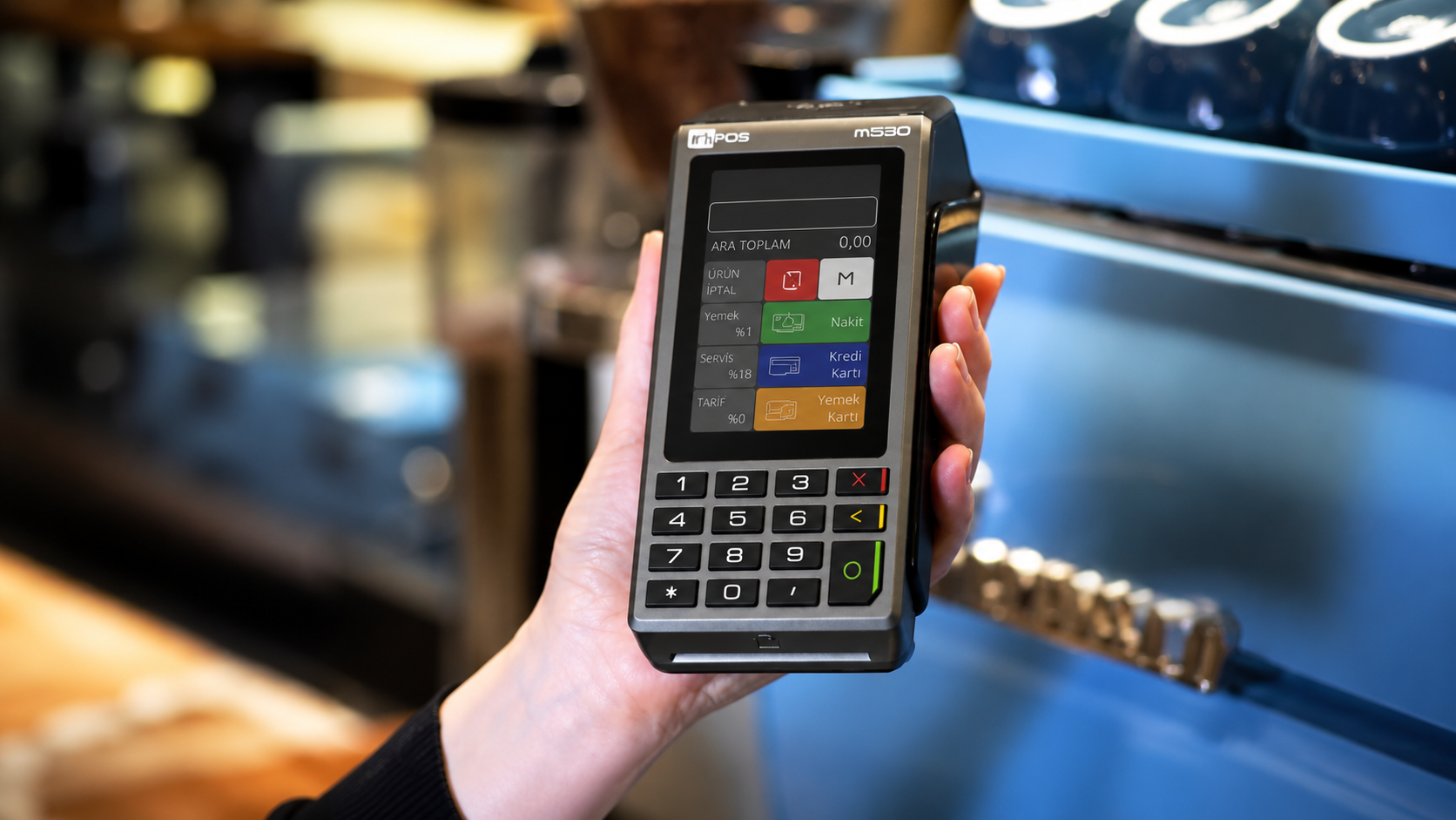
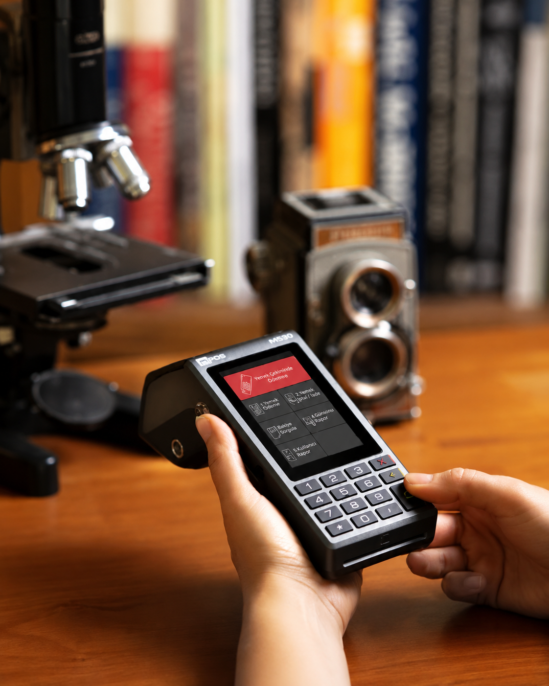
A dark-mode interface for a category that never questioned light backgrounds — built around one goal: getting the user to the transaction as fast as possible.
Inpos has been a partner since 2017, across multiple products and product generations. When the m530 touchscreen POS terminal needed an interface, they came to us already knowing our understanding of their brand — and more importantly, their relationship with their own users.
This wasn't a screen-skinning project. The scope covered the full usage scenario: every main screen, the menu structure connecting them, and every sub-section beneath — the complete information architecture a cashier moves through during a transaction.
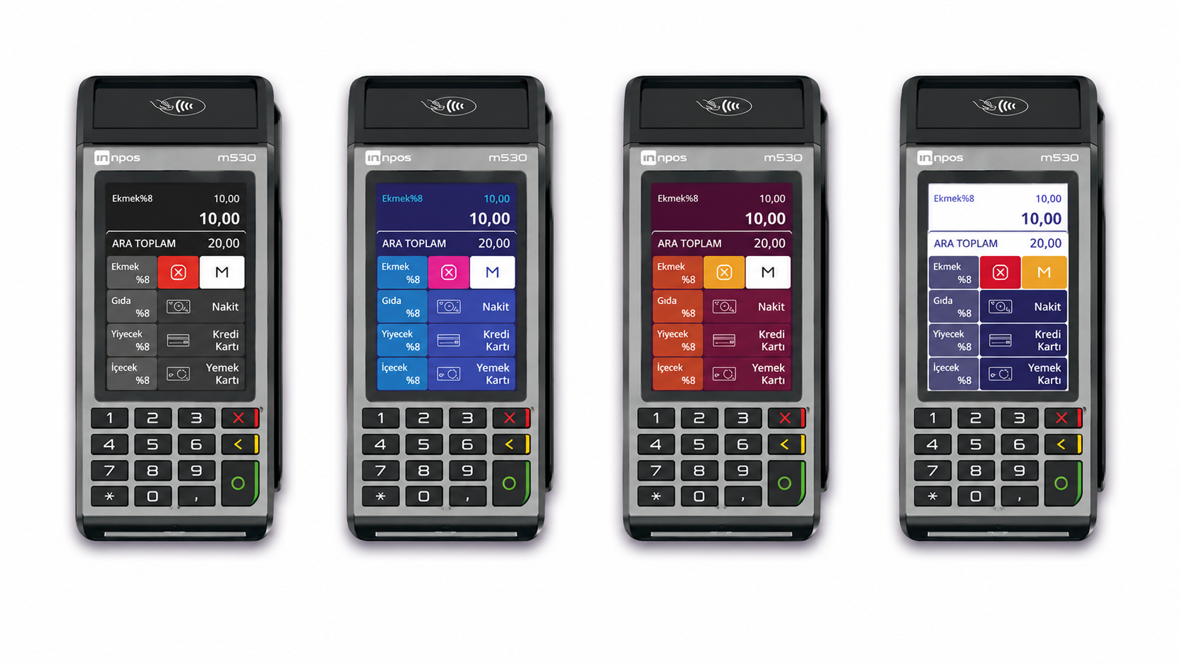
We started by listening, not designing. Every POS interface in the category defaults to a light background — so much so that it had stopped being a decision and become a habit. We treated that habit as the first thing worth questioning.
Beyond the visual layer, the real design problem was the path: how quickly can a cashier get from opening the screen to completing the transaction? Every menu level, every screen transition, was structured around minimizing that distance — speed and ease of use came before aesthetics at every decision point.
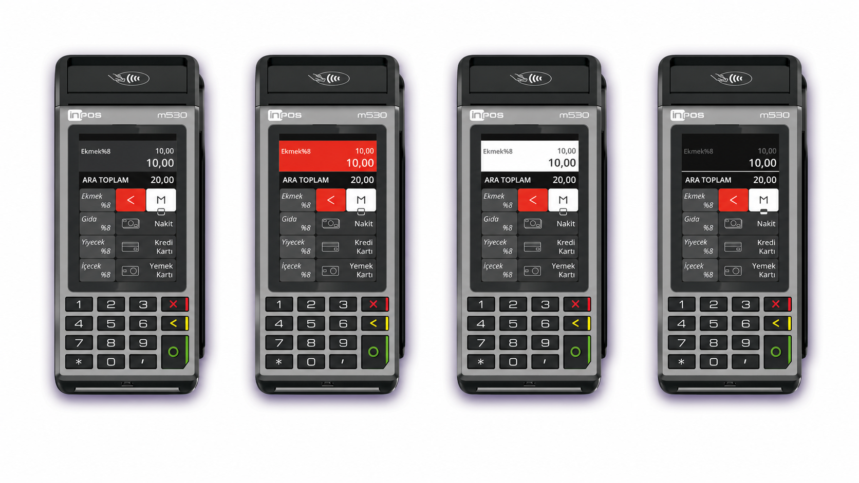
Everyone else designed for the screen. We designed for the cashier staring at it all day.
Idea
The task was to design a complete interaction system for the m530's touchscreen — not just its look, but the full menu hierarchy and usage flow — that genuinely reflected what Inpos's actual users wanted, not what the category assumed they wanted.
Speed of adaptation mattered as much as the interface itself. In a market where regulation shifts constantly, a structure that can't evolve quickly is already obsolete.
Form
We moved away from the light backgrounds nearly every competitor defaults to, building the interface around a dark base instead. It reduces glare during long shifts, reads more clearly under retail lighting, and simply feels less generic than the category standard.
On top of that base, customers could personalize their own color themes — giving Inpos's retail clients a way to make the hardware feel like their own, without touching the underlying system.
Function
Every main screen, menu, and sub-menu was mapped and designed as one connected system, not a series of disconnected views. The goal was singular: get the cashier to the transaction they need as fast as possible, and let the transaction itself complete just as quickly.
The screen layout stayed clean and attention-directing on purpose — every element earns its place. A cashier processing hundreds of transactions a day needs speed and clarity far more than decoration, and the entire menu structure was built around that reality first.
Differentiation
Most POS interfaces in the category look interchangeable because they're built around the same light-background convention — and most stop at the visual layer, leaving menu logic as an afterthought. Inpos's dark-mode approach, paired with a fully designed interaction flow, broke that pattern without sacrificing the regulatory compliance the category demands.
This wasn't a one-off interface for one product — it became the design and interaction language for Inpos's entire current lineup, and the foundation for what comes next.
Impact
The m530 system is now applied across Inpos's full product range, not just the model it was originally designed for. Future products are being developed in direct continuity with this family, rather than starting each interface from zero.
An eight-year partnership turned a single interaction system into the visual and structural standard for an entire hardware lineup.
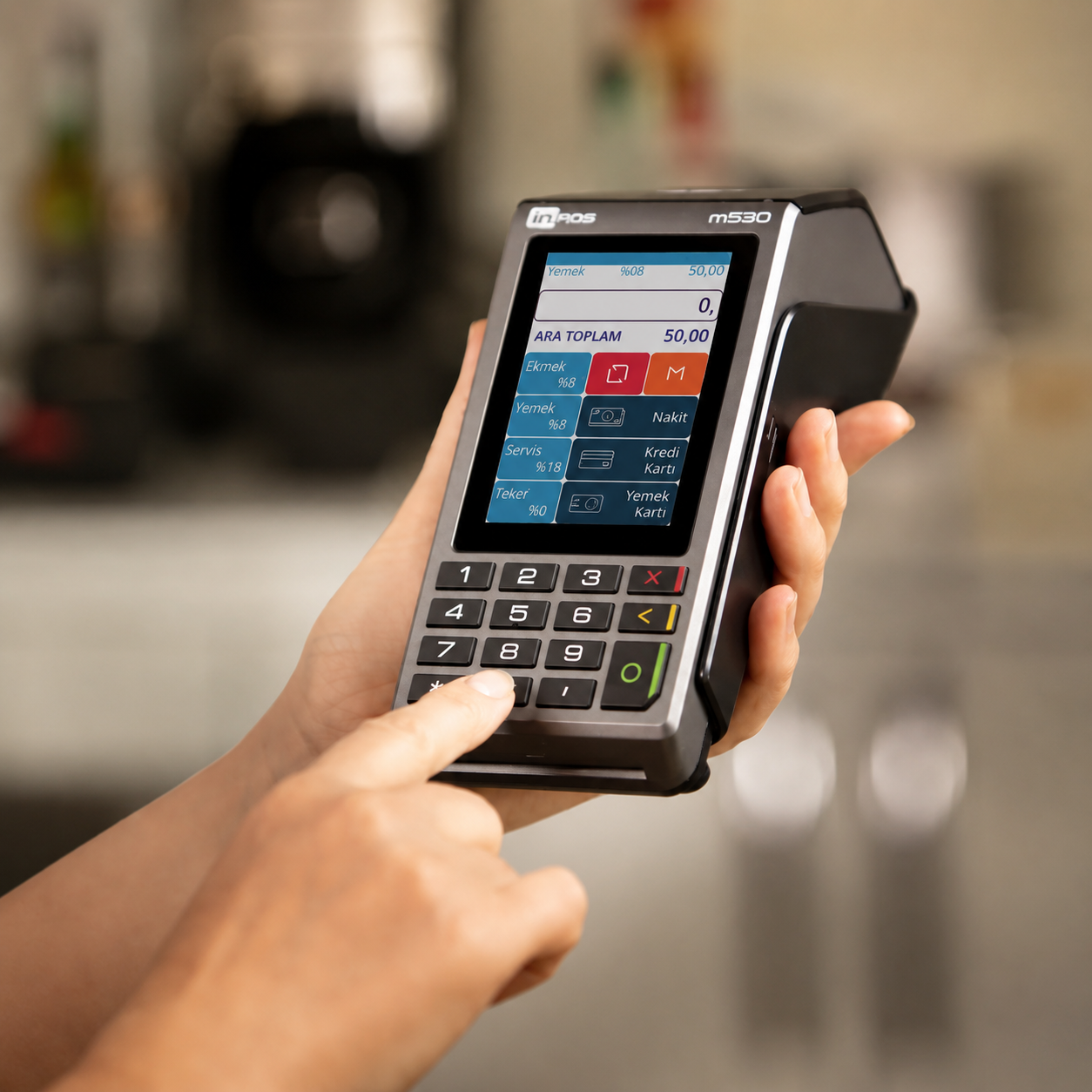
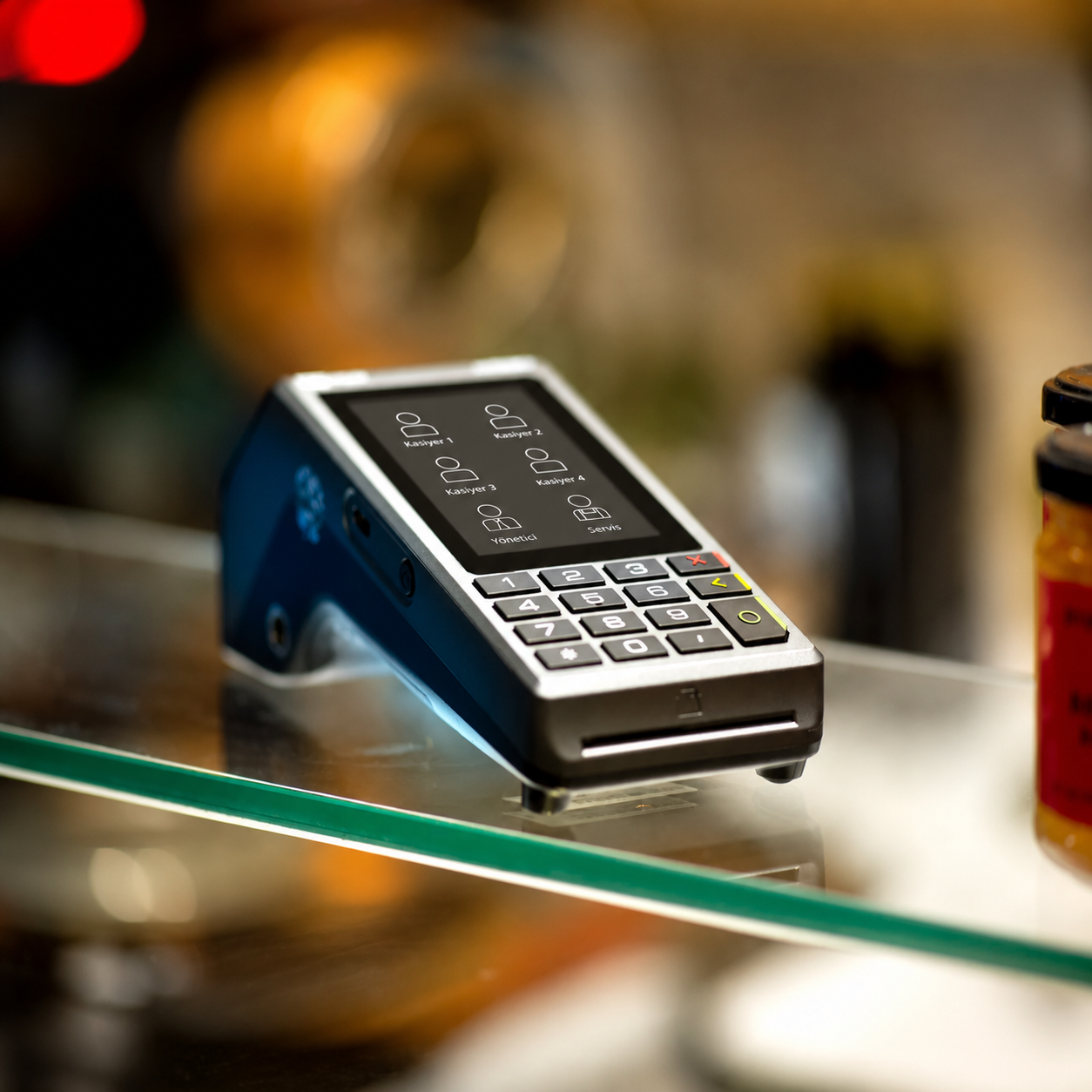
The hardest part wasn't the visual design — it was mapping an entire transaction flow, screen by screen, menu by menu, and making every path through it feel shorter than it actually was. Every decision had to account for a regulatory environment that could shift mid-project, which meant building flexibility into the structure rather than locking in a single fixed flow.
What made this project work was eight years of trust. We weren't proposing a dark interface and a new menu logic to a client meeting us for the first time — we were proposing it to a partner who already knew we understood their users as well as they did.
What began as a request for one terminal's interface became the complete interaction system for Inpos's entire product family — and the foundation for everything they build next, together with us.